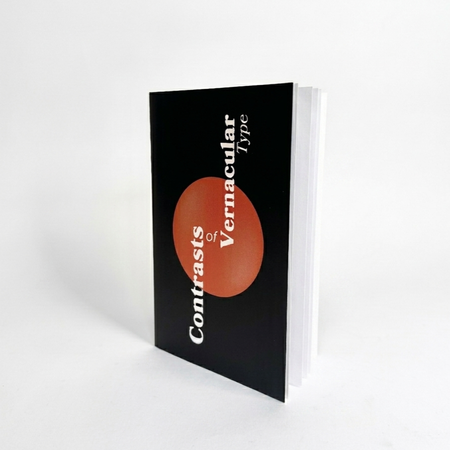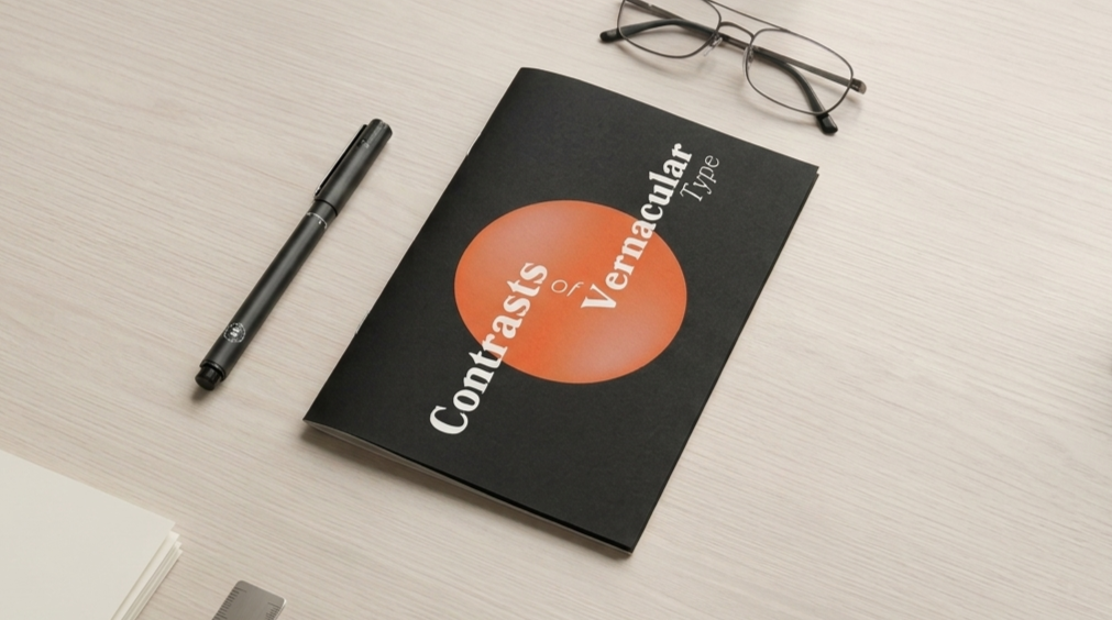
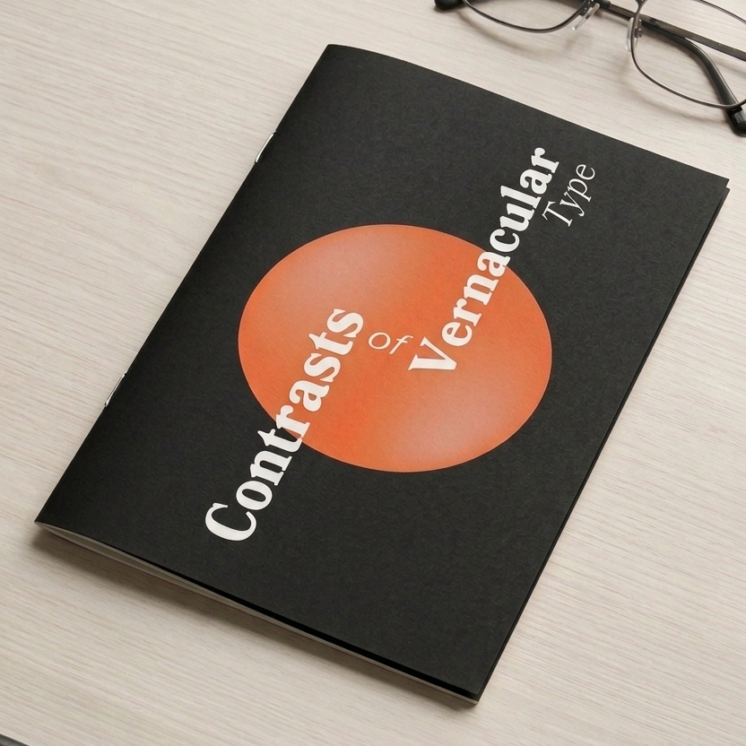
Designing a Booklet for Contrasts of Vernacular Type by Carl Dair.
Role
Visual Designer, Photographer
Tools
Adobe Indesign, Illustrator & Photoshop
Duration
Four Weeks
Type lives in the world.
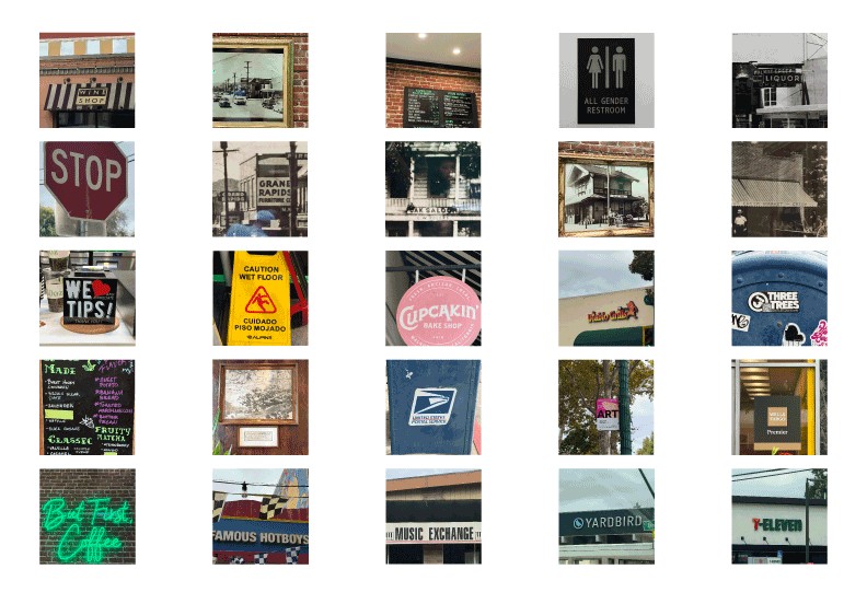
This project started with a book and ended with a printed object. Carl Dair's seven typographic contrasts gave me the framework. Then I took that framework out into the real world and started photographing the lettering that most people walk straight past, shop signs, hand-painted boards, and everyday type across three Bay Area cities.
The goal was to find vernacular letterforms that embodied Dair's principles, isolate them, and build a booklet that put theory and street-found reality in conversation with one another.
4
Carl Dair’s contrasts explored
4
Color palettes tested
26
Letters
3
Cities photographed
Process
Step 2
Go find it
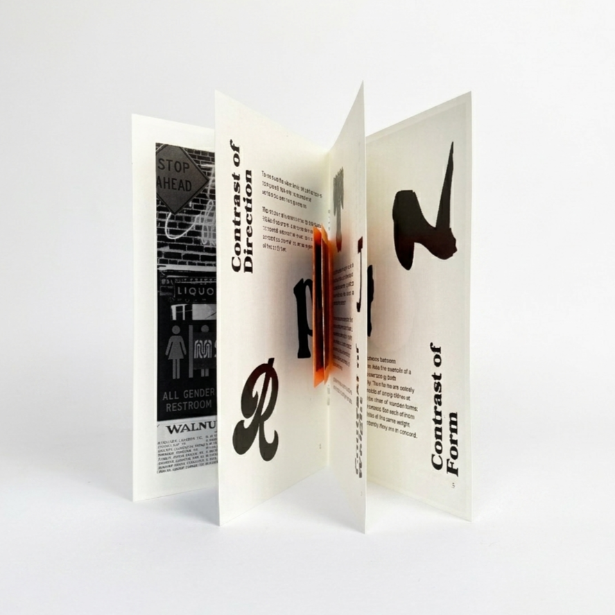
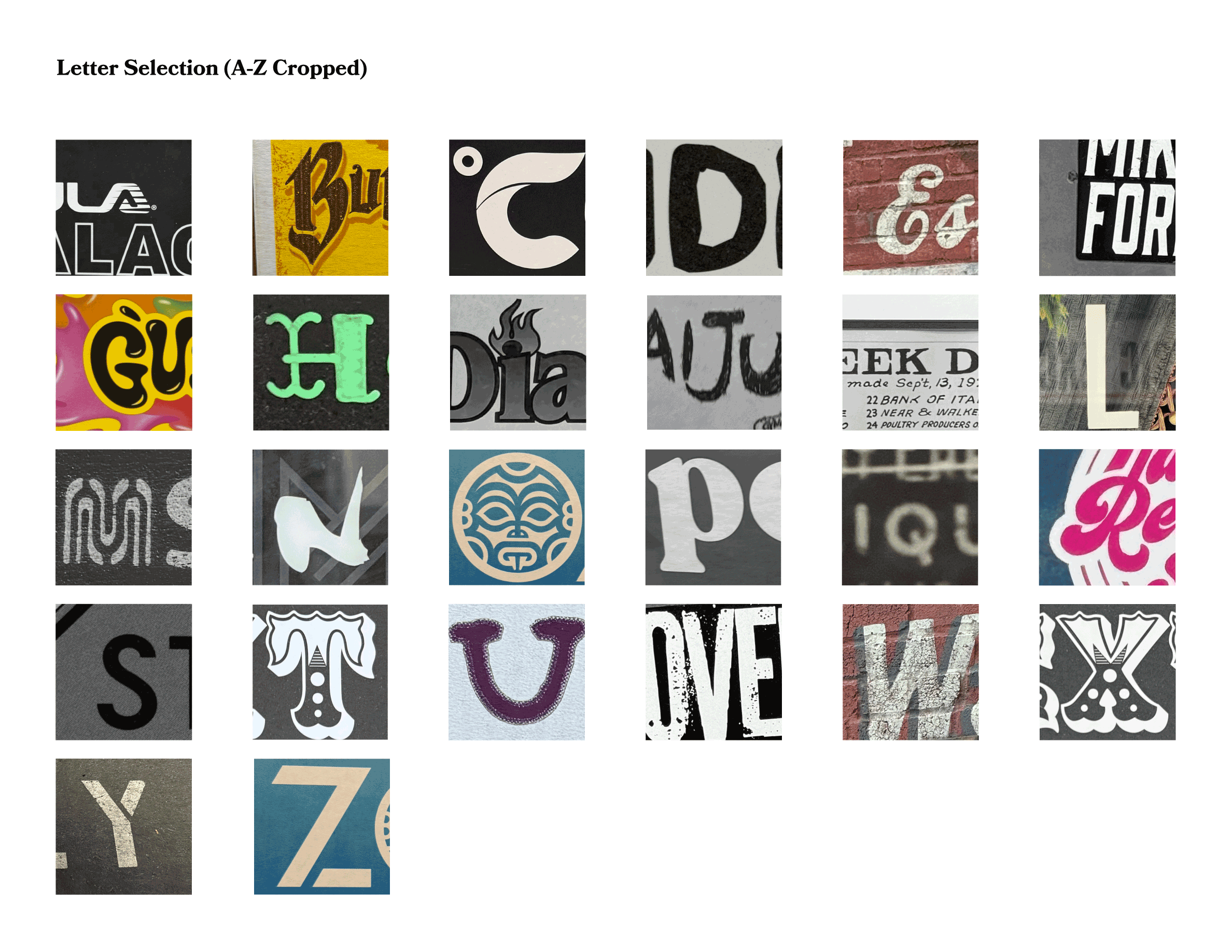
Walked through Walnut Creek, Concord, and San Francisco looking for letterforms in the wild. Shop signs, hand-painted boards, anything with character. Found all 26 letters of the Latin alphabet and picked 10 favourites.
Step 4
Design and print
Brought everything into InDesign and tested compositions, font combinations, and color palettes. Printed multiple versions. Got feedback from fellow designers and my professor. Made changes. Printed the final.
Step 3
Isolate and pair
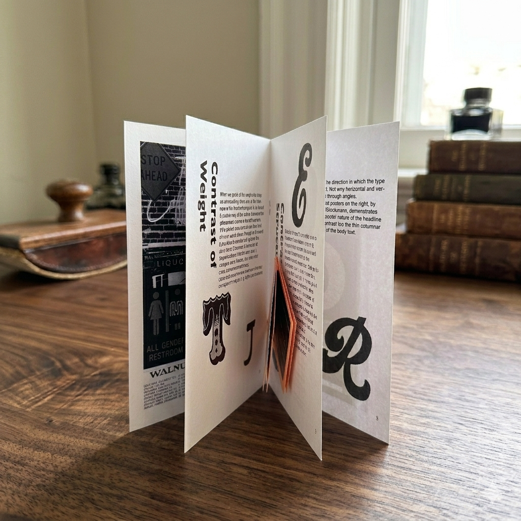
Processed everything to black and white, then inverted to reveal the raw weight and texture of each letter. Paired them to explore contrasts of weight, form, structure, and direction. Some pairings harmonized beautifully. Some clashed. Both were interesting.
Step 1
Study the theory
Read Carl Dair's seven contrasts and used them as a lens for everything that followed. Size, weight, form, structure, texture, colour, direction.
Photography


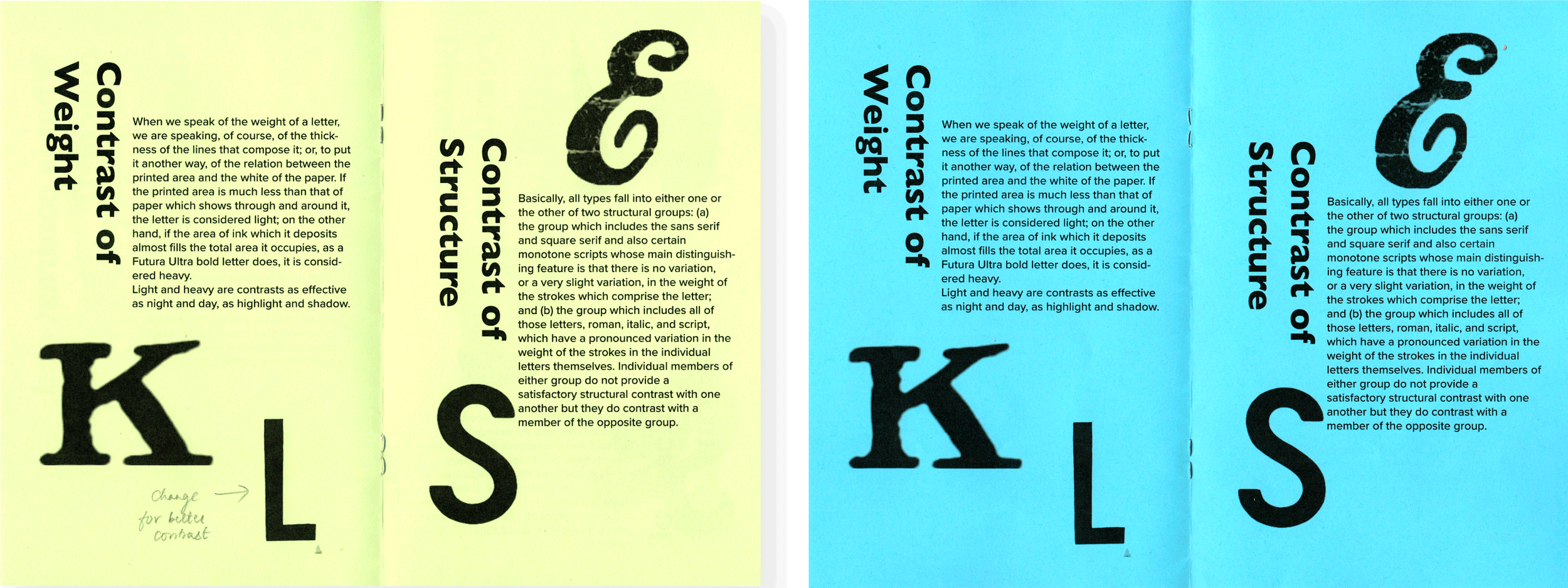
Two different coloured papers were used to experiment with how the text and the booklet’s content would look on Green and Blue Cardstock papers.
First Draft Feedback
Tightening up the leading in the subheaders
Choose letterforms to show the contrast of weight better
Booklet Cover Compositions
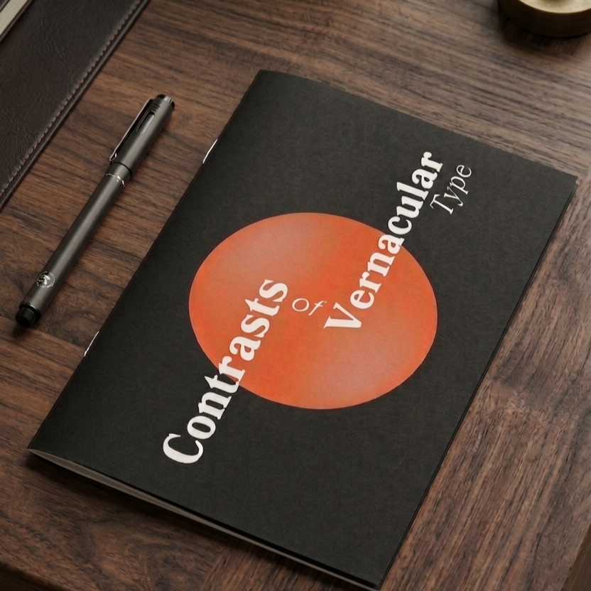
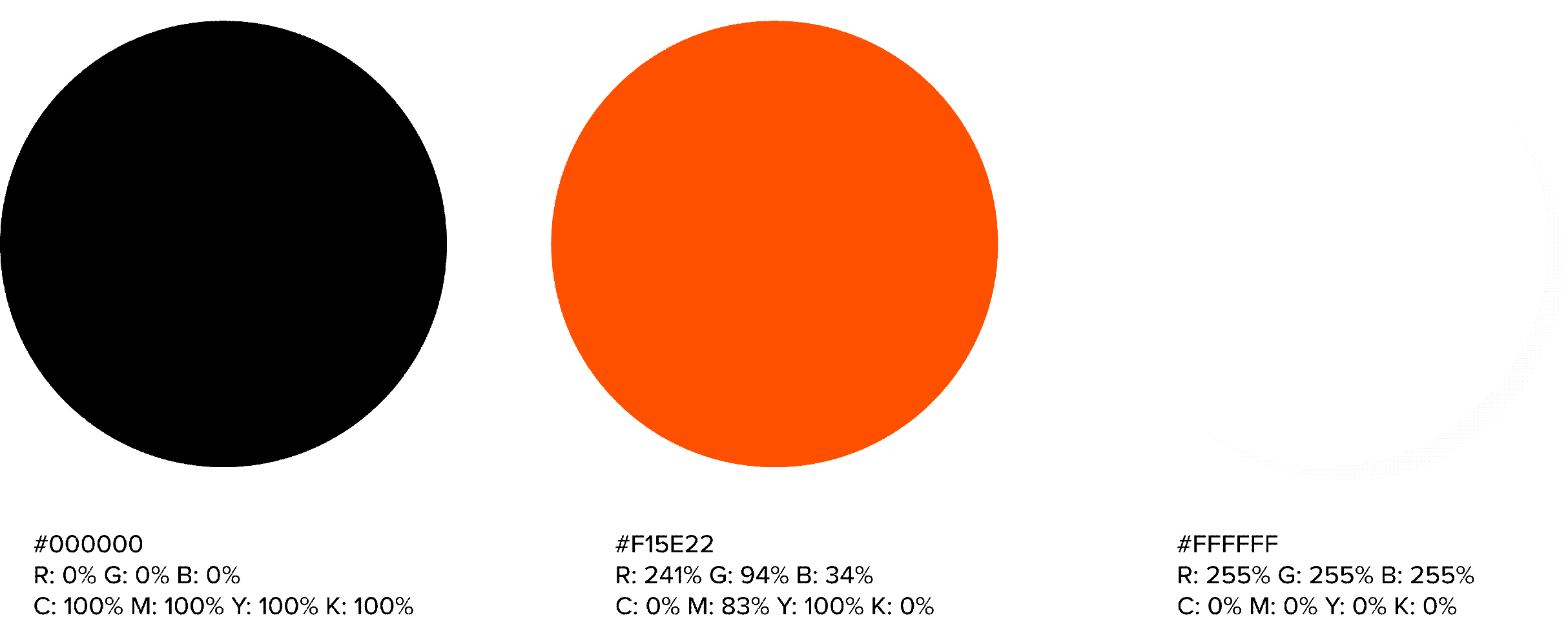
Different colours and compositions were tested out for the cover page of the booklet. Based on feedback, the decision to print two
covers for the semifinal presentation was made. A blue and pink combination, a black and orange combination, with a different
composition.

Feedback
This step of the process included reading out the project statement to the fellow designers while the booklets were passed around for observation and feedback.
Feedback for the semifinal presentation:
Carl Dair’s Name on the cover
Vectorize letterforms for visual clarity
Organise the pages
Widows need to be removed
Increase the spacing between E and the paragraph
The black and orange cover look better

Colour Palatte
Letterform Images
To create more visual interest and engagement, the decision to add the letterform image sources was made. This was printed on orange coloured paper and made into a mini booklet. This mini brochure of images is nestled between the pages corresponding to the letterforms in the image.

Final Booklet Design